Kobo Products: Modernization of a Technical B2B Website.
Project: UX Design Externship
Role: UX Researcher/Designer
Timeline: January 2026 - May 2026 (4 Months)
Team:
6 person Cross-Functional Externship Team
2 Rutgers Advisors
2 Kobo Advisors
Disclaimer!!
This project is under an NDA, any product names, information, and details provided in this project can be directly found on Kobo’s Website. All other information was omitted for the sake of this portfolio.
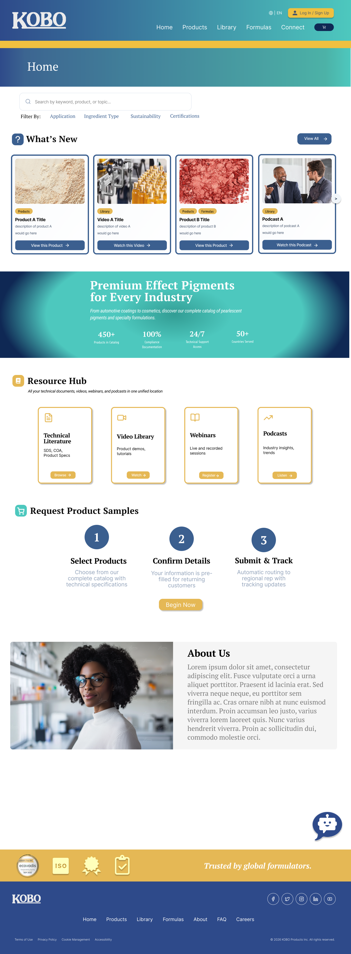
Table Of Contents
Part 1: The Research
Part 2: The Design
Project Overview
About Kobo:
Kobo Products is a B2B cosmetics ingredient company whose website functions as a technical database for formulation chemists, distributors, and sales teams.
The Challenge:
The existing experience contained extremely valuable technical information, but the platform suffered from:
Outdated Visual Hierarchy
Dense Information Architecture
Inconsistent Interaction Patterns
Limited Discoverability
Weak Mobile Responsiveness

The Goal:
Improve find-ability, usability, and modern visual clarity while preserving the depth of technical information expert users rely on.
Part 1: The Research
Concept Map:
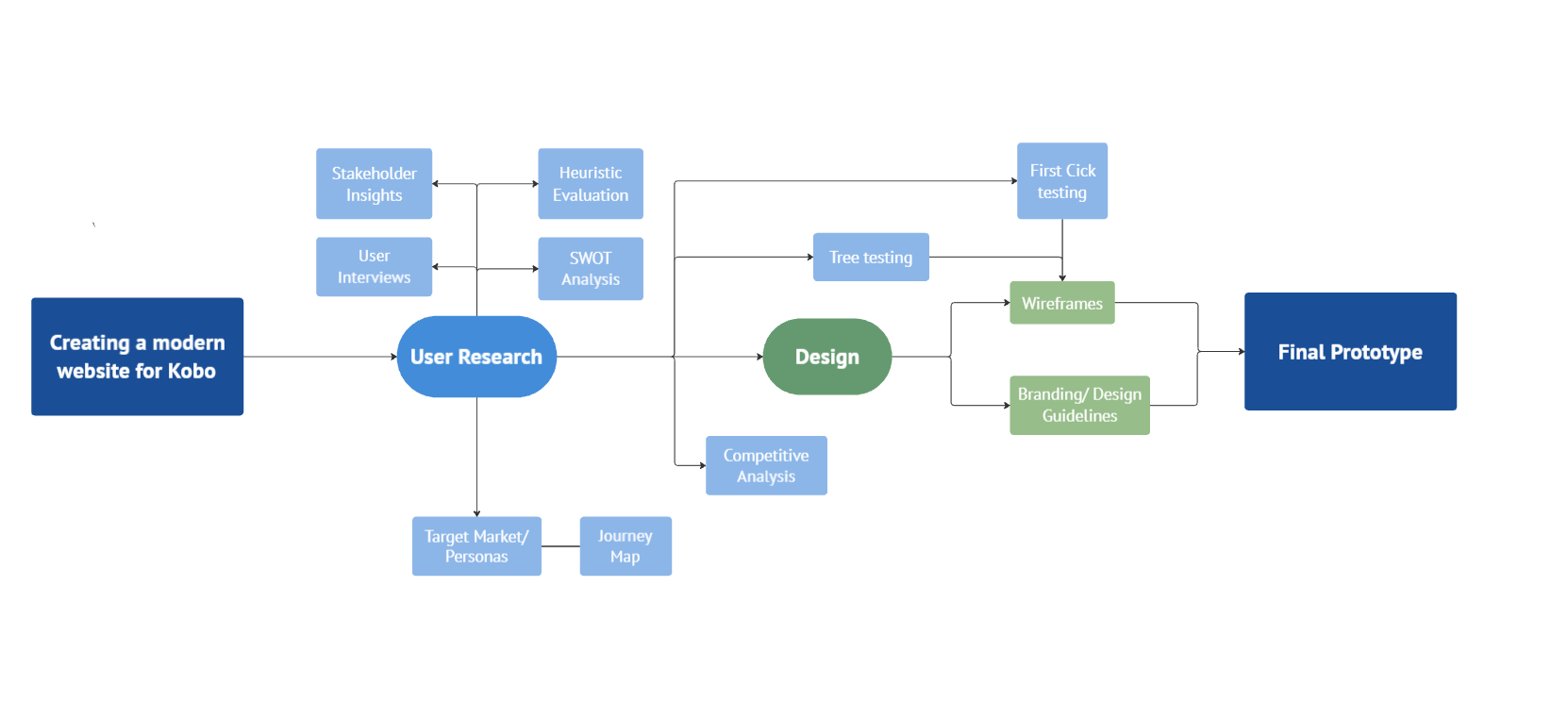
Preliminary Research and Proto-Personas
Though we know its not best practice we did not have access to Kobo personel for interviews right off the bat, so we started with a competitive analysis and formed proto-personas to guide our future interview questions.
Competitive/Swot Analysis
We analyzed 3 Direct competitors and 2 indirect competitors to give us an overall glance at who and what we should be designing for based on the requirements document brought to us.
*Research generated by humans, Table/Code generated by AI
| Dimension | Kobo Products | Competitors | Analysis |
|---|---|---|---|
| Navigation & IA |
Gap: High
|
|
Competitors reduce cognitive load through hierarchical depth and guided discovery. Kobo's navigation is functional but lacks the structure to help unfamiliar users find what they need quickly. |
| Search & Filtering |
Gap: High
|
|
Kobo's search functions like a static database lookup rather than a dynamic exploration tool — limiting efficiency for formulators seeking specific performance or regulatory attributes. |
| Product Pages |
Gap: High
|
|
Competitors support faster comprehension and decision-making through visual hierarchy. Kobo provides necessary data but lacks the contextual cues that guide users toward action. |
| Educational Content |
Gap: Medium
|
|
Kobo's separation of literature from product discovery adds friction. |
| Visual Design |
Gap: Medium
|
|
Visual hierarchy reduces scanning effort — the area where competitors outperform Kobo most consistently. Multiple interviewees described the site as outdated and visually overwhelming. |
| Access Model |
Kobo Advantage
|
|
Kobo's open access policy is a genuine competitive advantage. |
Kobo Strengths
- Clear access to technical data and SDS documents
- Straightforward product categorization
- Functional database-style search
- Comprehensive product listings in one view
- No login required — open catalog access
Kobo Weaknesses
- Limited faceted filtering and advanced search
- Text-heavy product presentation, minimal imagery
- Lack of visual hierarchy and modern UI patterns
- Resources not contextually integrated with products
- No product selector tools or guided workflows
- Customers routing through 3rd party instead of the Kobo site

Proto-Personas
These three personas cover Kobo's core use cases: technical evaluation, customer selling, and regional distribution. Designing around them meant the site had to work as a scientific reference AND a mobile sales tool simultaneously.
Goal: Find ingredients, download SDS, pull starter formulas.
Pain Point: Search too basic, no filtering/autocomplete function.
Success Looks Like: Finds 2–3 viable ingredients/a starter formula quickly.

Goal: Use the site as a live product catalog.
Pain Point: Site not mobile-friendly, links don't share cleanly.
Success Looks Like: Pulls up product page mid-call, shares a clean link instantly.

Goal: Stay current, confirm regional products, download brochures.
Pain Point: Can't always tell what's regionally available.
Success Looks Like: Always has the newest materials on hand.
Heuristic Evaluation
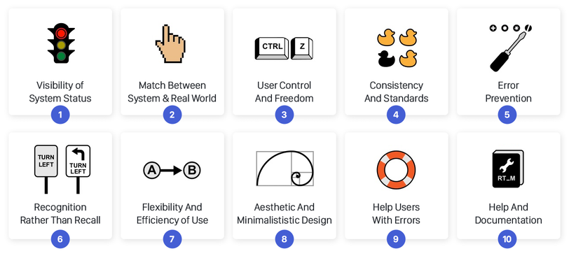
Next we evaluated the website based on Jakob Neilsons 10 Heuristics to help aide in what had to be fixed design wise before we had access to Kobo personel for interviews
*Research generated by humans, Table/Code generated by AI
| Page | Heuristic | Finding | Impact |
|---|---|---|---|
| Home Page | |||
| Home | Visibility of System Status |
Severity: High No system feedback when actions occur. Users have no confirmation that clicks or interactions have registered. |
Users are left uncertain whether the system responded to their input, increasing the likelihood of repeated actions or abandonment. |
| Home | User Control & Freedom |
Severity: Medium No "back" affordance provided. Users must rely on browser controls to reverse navigation. |
Reliance on browser back button breaks the designed flow and disorientation is compounded when browser history is unclear or shared. |
| Home | Aesthetic & Minimalist Design |
Severity: Medium Dense layout with no whitespace. Primary actions compete visually with informational content, creating a cluttered hierarchy. |
Users struggle to identify what to do first. Key CTAs are buried, reducing conversion from the homepage to deeper product exploration. |
| Products Page | |||
| Products | Visibility of System Status |
Severity: High Clicking column headers unexpectedly opens PDF slideshows with no warning or indication that this will happen. |
Users expect column headers to sort — a universal web convention. Triggering a PDF download instead is a significant violation of learned behavior and breaks task flow. |
| Products | User Control & Freedom |
Severity: High No persistent "Back to Products" link after entering a product detail. Users feel disoriented and must rely on the browser. |
Loss of place in a large catalog is a high-cost error. Users comparing multiple products across categories face repeated re-navigation from scratch. |
| Products | Recognition vs. Recall |
Severity: Medium No thumbnails or visual cues on product listings. Users must recall product names from memory to identify what they need. |
Particularly damaging for effect pigments and pearlescent lines where color and visual appearance are the primary selection criteria. Confirmed by Jessica and Samantha in interviews. |
| Formulas Page | |||
| Formulas | Consistency & Standards |
Severity: High Column headers redirect to new pages instead of sorting the table in place — breaking a universal web convention. |
Users who click to sort are unexpectedly navigated away from their current context. This creates confusion and adds unnecessary steps to formula comparison tasks. |
| Cart / Sample Request | |||
| Cart | Error Prevention |
Severity: High Required fields are not clearly indicated. Users can attempt to submit an incomplete form without knowing which fields are mandatory. |
Form submission errors frustrate users and erode confidence. For a sample request — a high-intent action — a failed submission risks losing the lead entirely. |
| Cart | Visibility of System Status |
Severity: Medium No real-time validation feedback while filling out the sample request form. |
Users only discover errors at submission rather than during input, increasing the effort required to correct mistakes and reducing form completion rates. |
| Contact & Literature | |||
| Contact & Literature | Consistency & Standards |
Severity: Medium Dual navigation systems exist simultaneously — clickable headers and side tables — creating redundancy and visual clutter without clear differentiation. |
Two competing navigation systems force users to evaluate which one to use, adding cognitive load and increasing the chance of choosing an inefficient path. |
| Contact & Literature | Aesthetic & Minimalist Design |
Severity: Medium Small font sizes throughout reduce readability, particularly in the literature listing view where dense rows of text require close reading. |
Reduces accessibility and increases reading fatigue, particularly for users scanning for a specific document title across a long list. |
Stakeholder/User Interviews
We conducted 6 total interviews with Kobo representatives from all around the world, with the goal of finding out where their struggles lie as well as the things they’d like to preserve about the site.
Below are quotes and actionable insights gained from each interviewee
Interviewee 1: Senior Director, Scientific Marketing (30 years, PhD Biochemistry)
“It's absolutely ugly... not sexy. Definitely not." - on the homepage
This interviewee is the database gatekeeper.
He wants to preserve this skeleton but revolutionize the skin around it. His vision is a solution-based entry point: "What do you want to develop today?" Letting users enter by product goal rather than ingredient category.
He also surfaced the Five Pillars of Kobo communication (Portfolio, Global Operations, DE&I, Sustainability, Transparent Partnership) that he wants centered in the redesign.
Interviewee 4: Senior Account Manager (4 years, former Kobo customer)
"The website doesn't make us operate efficiently."
They confirmed that multiple customers are routing sample requests through UL Prospector rather than Kobo's own cart, including requests for products Kobo no longer even carries.
Product duplication problem: the same SKU appearing under three different category pages (e.g., cosmos-certified, natural origin, and standard silica) making search results cluttered and confusing.
She liked that navigation was clean and everything was on one page
Interviewee 2: Sales Representative, Asia Pacific (15 years, based in Australia)
"The customers have to click many times to get to the right information."
The top concern is distribution area clarity: Asia Pacific customers can't tell which products are regionally available to them.
They flagged the SPF calculator access flow as broken — it currently requires customers to go through a salesperson to get authorization, adding friction to a self-service tool.
Interviewee 5: Account Manager, formerly Marketing + Sampling dept.
"You really have to know how to navigate our website to get what you need."
Product images are missing for the pearl/effect pigment lines. customers request all five color variants of a pearl because they can't see which shade is which, costing Kobo unnecessary shipping.
Interviewee 3: Sales Account Manager + Marketing (internal Kobo)
"As a customer, I totally didn't realize they had this whole entire section for finished formulations. And the literature section? Forget about it, I never knew it existed."
They worked as a Kobo customer for 10+ years before joining the company, so she can speak to both sides.
The three core sections (Products, Formulas, Literature) are so siloed that even experienced users don't know all three exist.
They also introduced UL Prospector. a third-party industry ingredient database that Kobo's own customers are using instead of the Kobo site to find and request Kobo products.
Interviewee 5: Applications Lab Group Leader, Asia Pacific (Japan)
"If the interface was more user friendly, I would reach for it more… and customers would too."
They represent the technical/chemists.
lack of searchable formula content. You can't filter formulas by ingredient, which means downloading every single PDF one by one
Kobo's no-registration policy is a competitive advantage. Most competitor sites require signup before you can access product data. Kobo's open access is valued and should not be removed.
Key Findings/Insights
1. The site is a database pretending to be a website.
The text-table layout works, but it creates a wall for anyone who didn't already know what they're looking for.
3. The site has a loyalty problem, not just a usability problem.
Customers aren't just struggling on the Kobo site, they've built workflows around it. Interviewees confirmed that a significant portion of customers go to UL Prospector to find and request Kobo products instead. That goes beyond a discoverability issue.
Issues to Tackle:
The site is invisible to its own users
Too many clicks, no clear path
The formula section is broken as a discovery tool
UL Prospector is eating Kobo's direct traffic
2. Two incompatible audiences, one experience.
Persona Frances (the chemist) needs dense technical data. Persona Sam (the sales rep) needs a clean mobile-friendly catalog. The current site serves neither well.
4. The cart is the worst place to create friction.
Every interviewee who touched on the sample request process described the same drop-off: users find a product, intend to request a sample, hit a wall of unlabeled required fields with no validation, and abandon to email instead. The cart represents the highest-intent moment in the entire user journey, and it's where the site is most vulnerable.
Features to Keep:
No login wall
All products visible on one page
The product reference skeleton
The cart/sample request concept
Part 2. The Design
*Click full screen button to view the Figma Prototype*
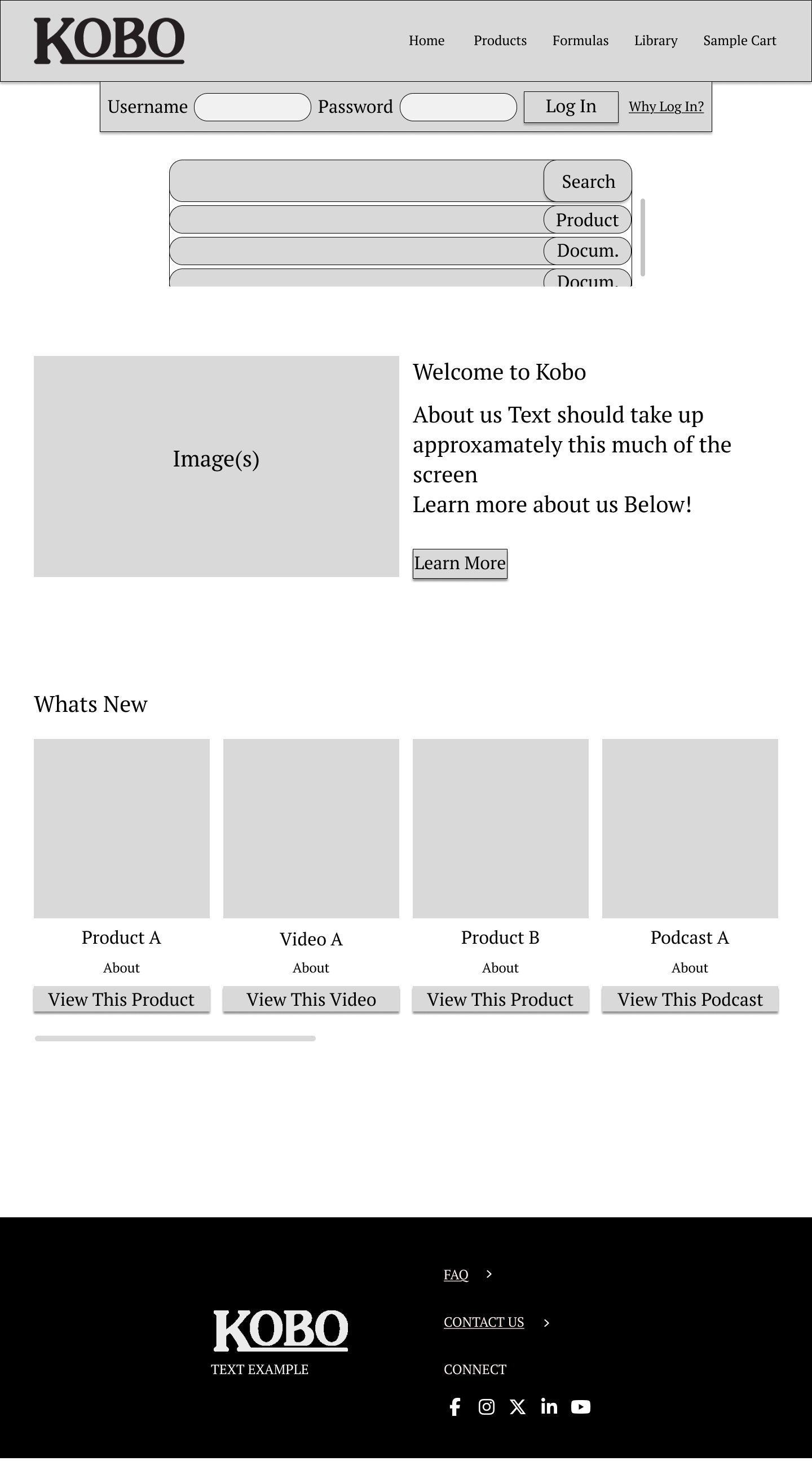
Wire Frames
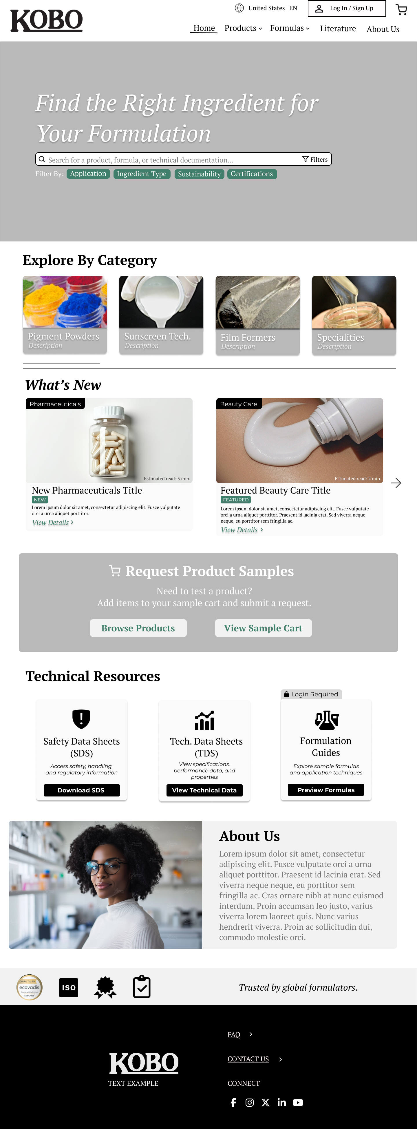
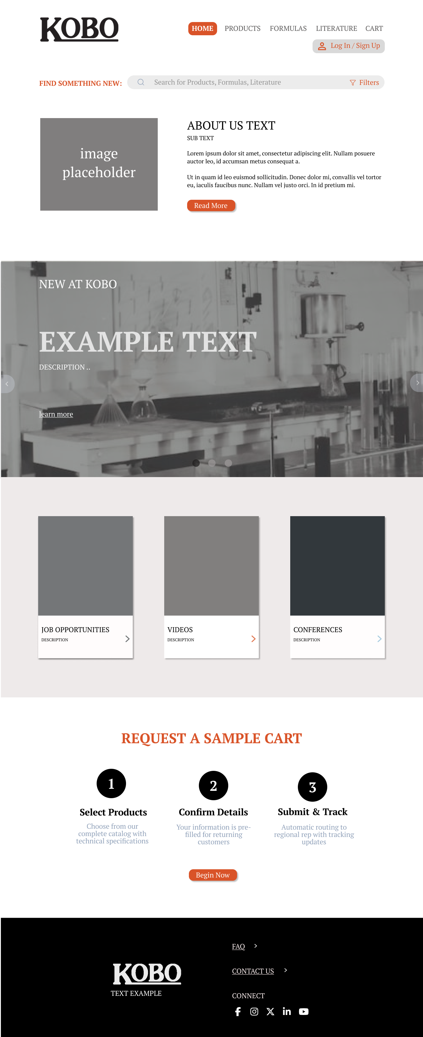
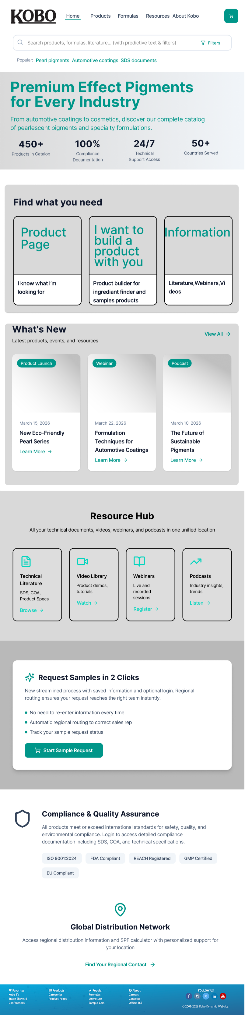
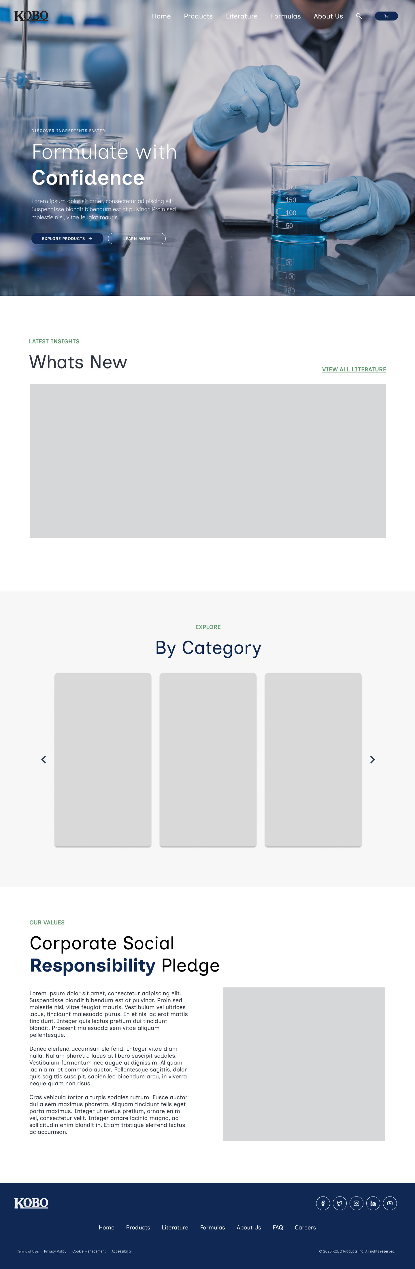
Each team member developed an independent homepage concept. Exploration covered full visual redesign, solution-based entry points, featured products, and a modernized nav. The final direction synthesized the strongest elements from each.
Color
Navy: #2D3C87
Symbolizing Authority, trust, and stability, Navy anchors all layouts and navigation.
Design System
Working with Kobo, we narrowed down our design system, describing how they wanted the new website to look and feel. "We're a professional company... I would want it more appealing, more inclusive to everybody." and “It's not sexy. Definitely not... the package will be nicer and easier to navigate — I think more people will be drawn to this." we took their feedback and came up with:
Teal: #3C96A5
Symbolizing sophistication, calmness, and renewal, Teal signifies interactive elements, links, and data displays.

The navy-to-teal gradient was chosen to represent the relationship between trust and renewal. Used consistently across the top navigation bar and hero banners, it gives the site a distinct visual signature that the original site lacked entirely.
Gold: #E1B44B
Symbolizing Positivity, achievement, and wisdom, Gold is reserved for accents, and highlights.
Typography
Headings: A sans-serif is used for all section headers ("What's New," "Resource Hub," "Products," "Related Formulas"). Weight is bold, tracking is tight, no decorative variation. This is a deliberate departure from the old site's undifferentiated text.
Body / UI text: A lighter weight of the same sans-serif family handles product descriptions, filter labels, card body copy, and form fields. Line-height is generous relative to the old site, creating the breathing room that was flagged as missing in the heuristic evaluation.
Italic accent: The footer tagline — "Trusted by global formulators." — uses an italic serif, the only instance of a contrasting typeface in the entire system. It's used sparingly and intentionally as a brand voice moment.
Prototype Screens
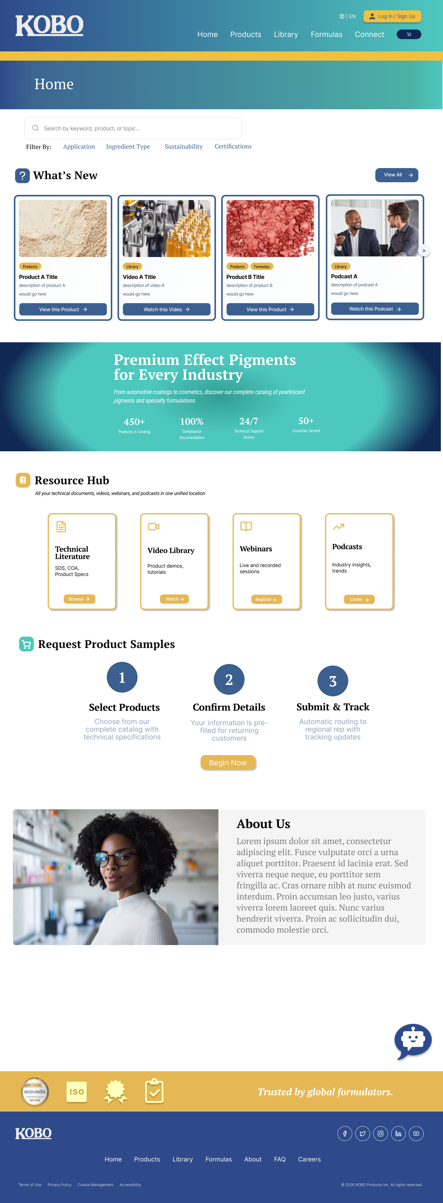
Homepage/Nav Bar
What’s New updated
Modernized Nav Bar and Hero Block
Sign-in made prominent with perks
Unified Library section (previously “Literature”)
Kept what Kobo felt was important for them (What’s new, Resource hub) while refreshing the look.
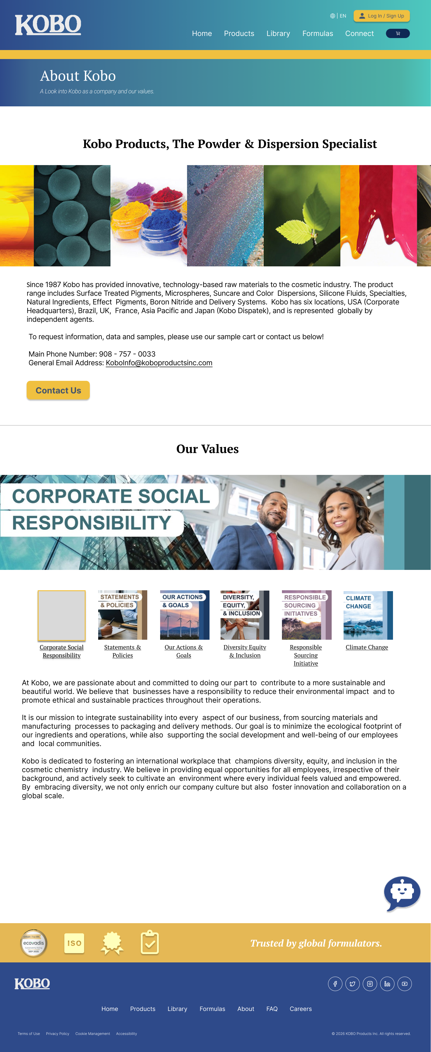
About Kobo
Combined the about page and 5 pillars of Kobo to create one efficient page insteada of create more clicks.
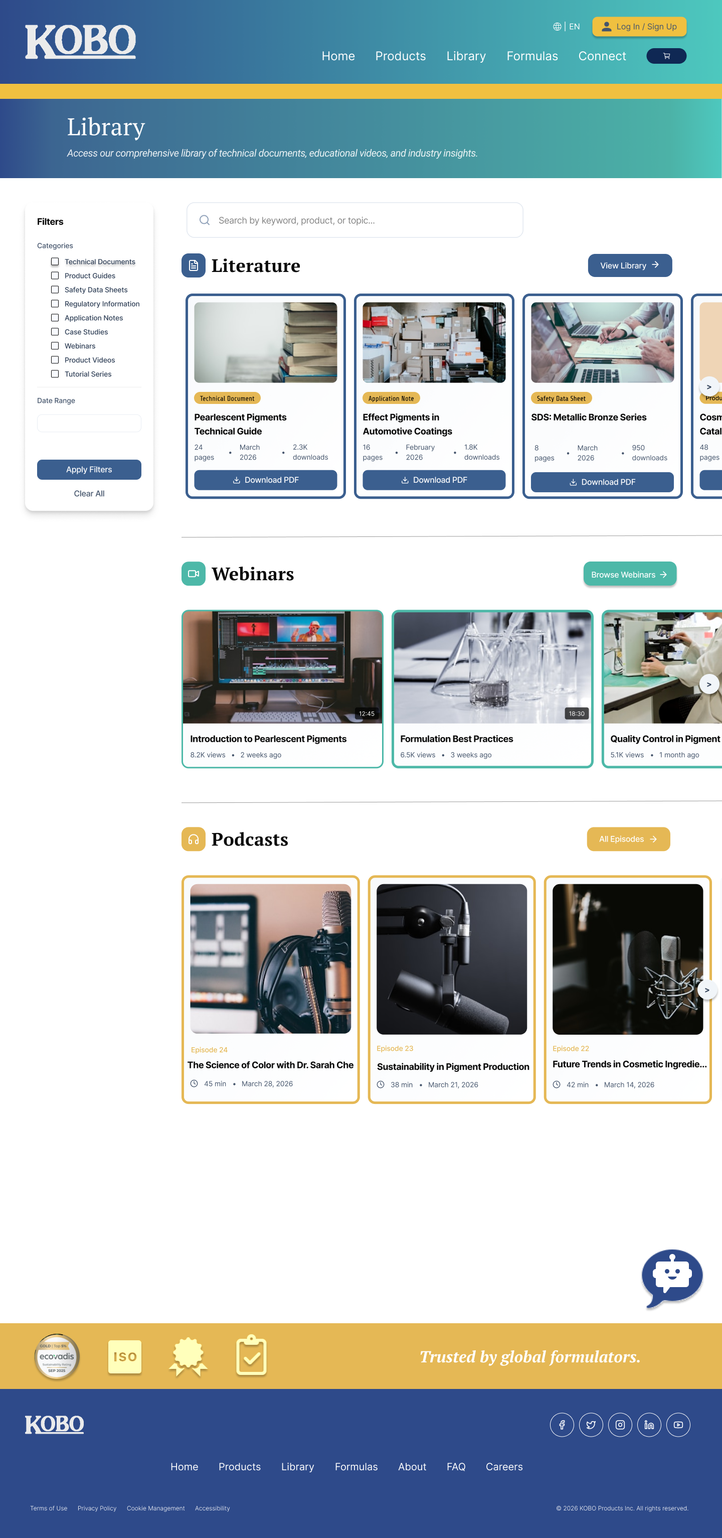
Library
Unified Literature section: technical docs, webinars, podcasts, and posters all in one place
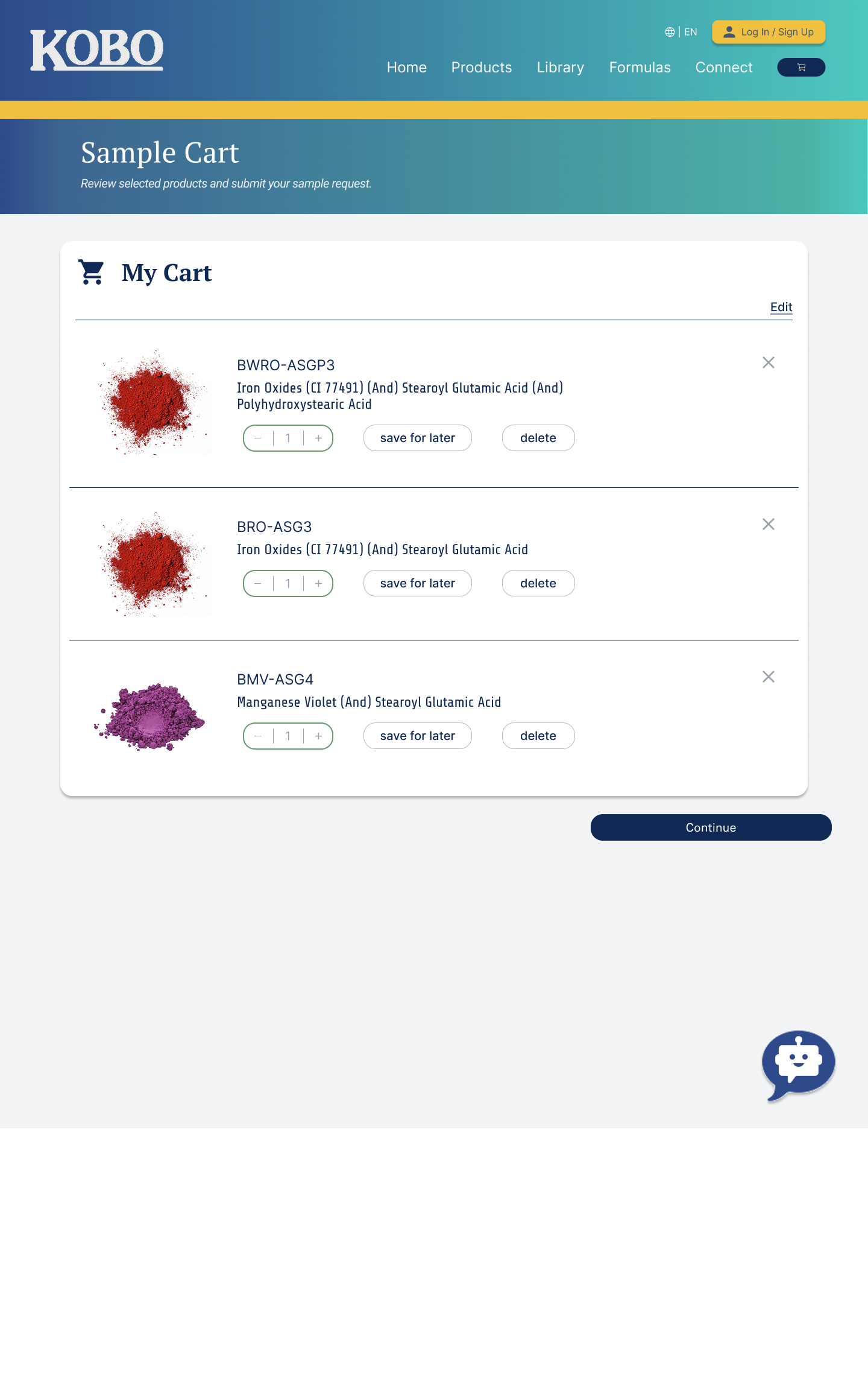
Sample Cart
Streamlined sample request
Validation accounted for
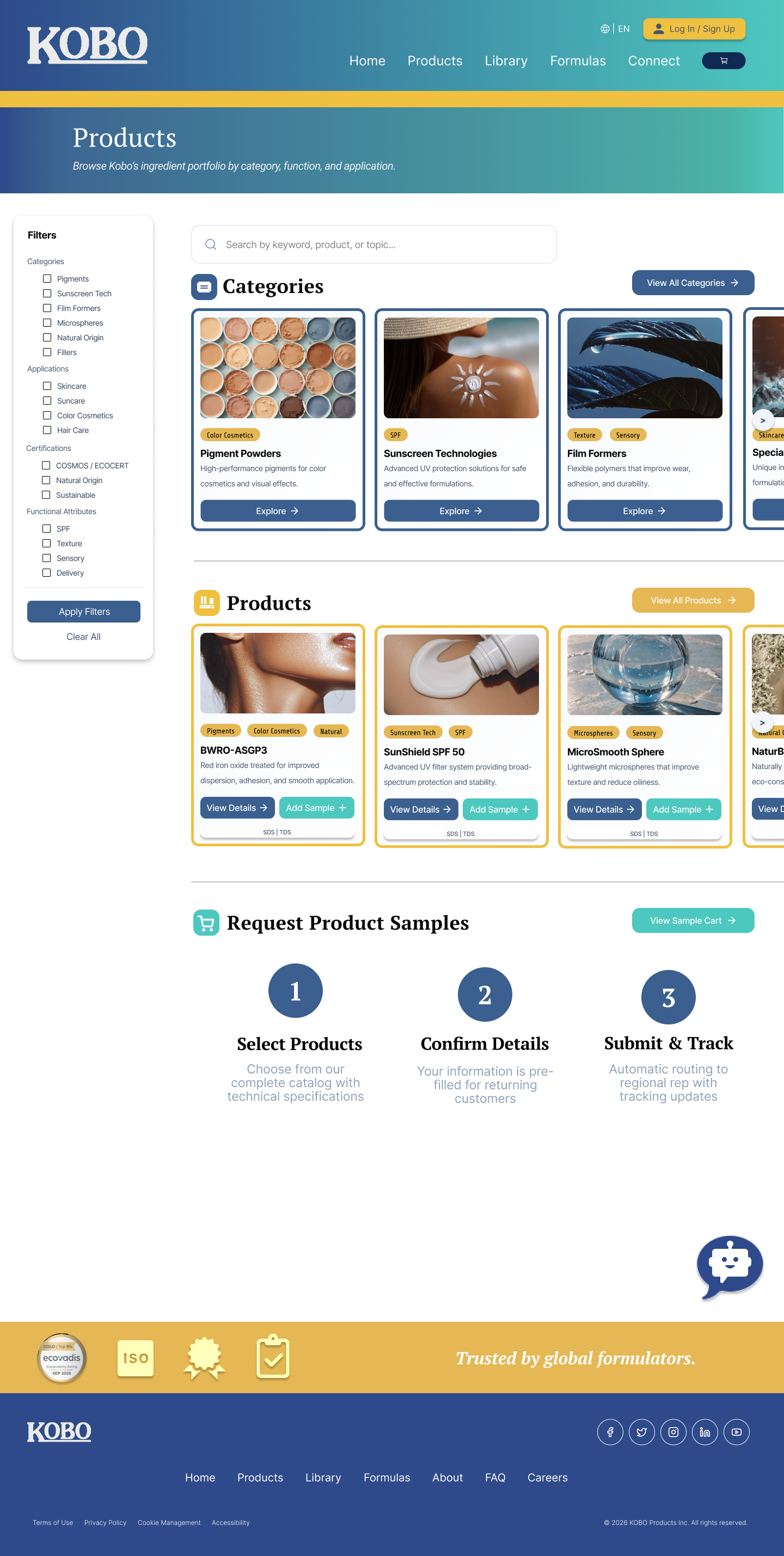
All Products (Left)
Visual hierarchy applied to product cards
Filtered browsing replacing text tables
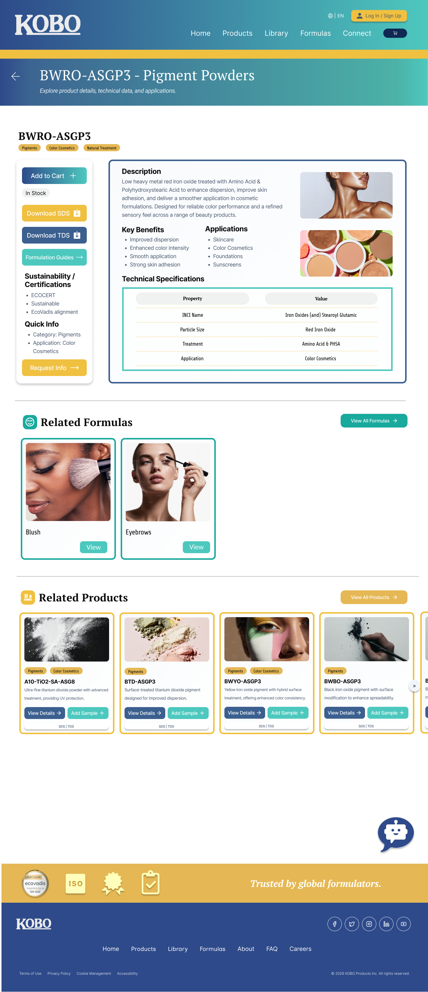
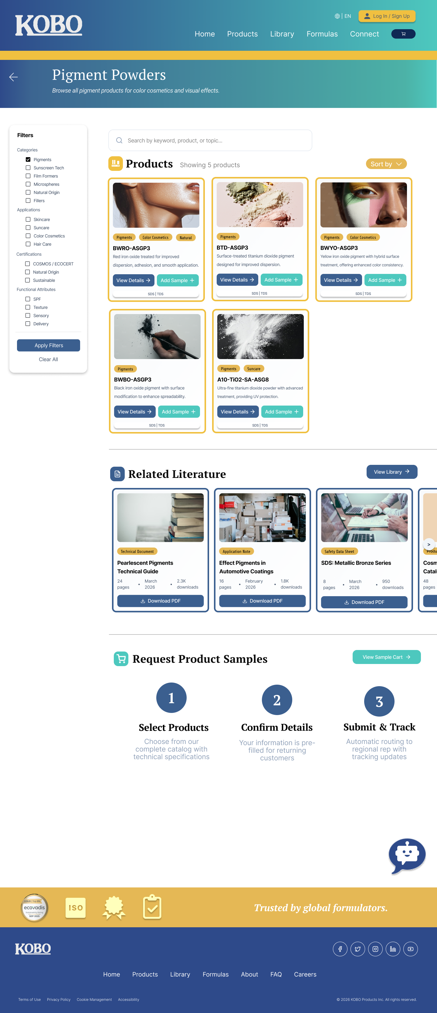
Specific Category (Mid)
Detail View: structured sections replacing raw data dumps.
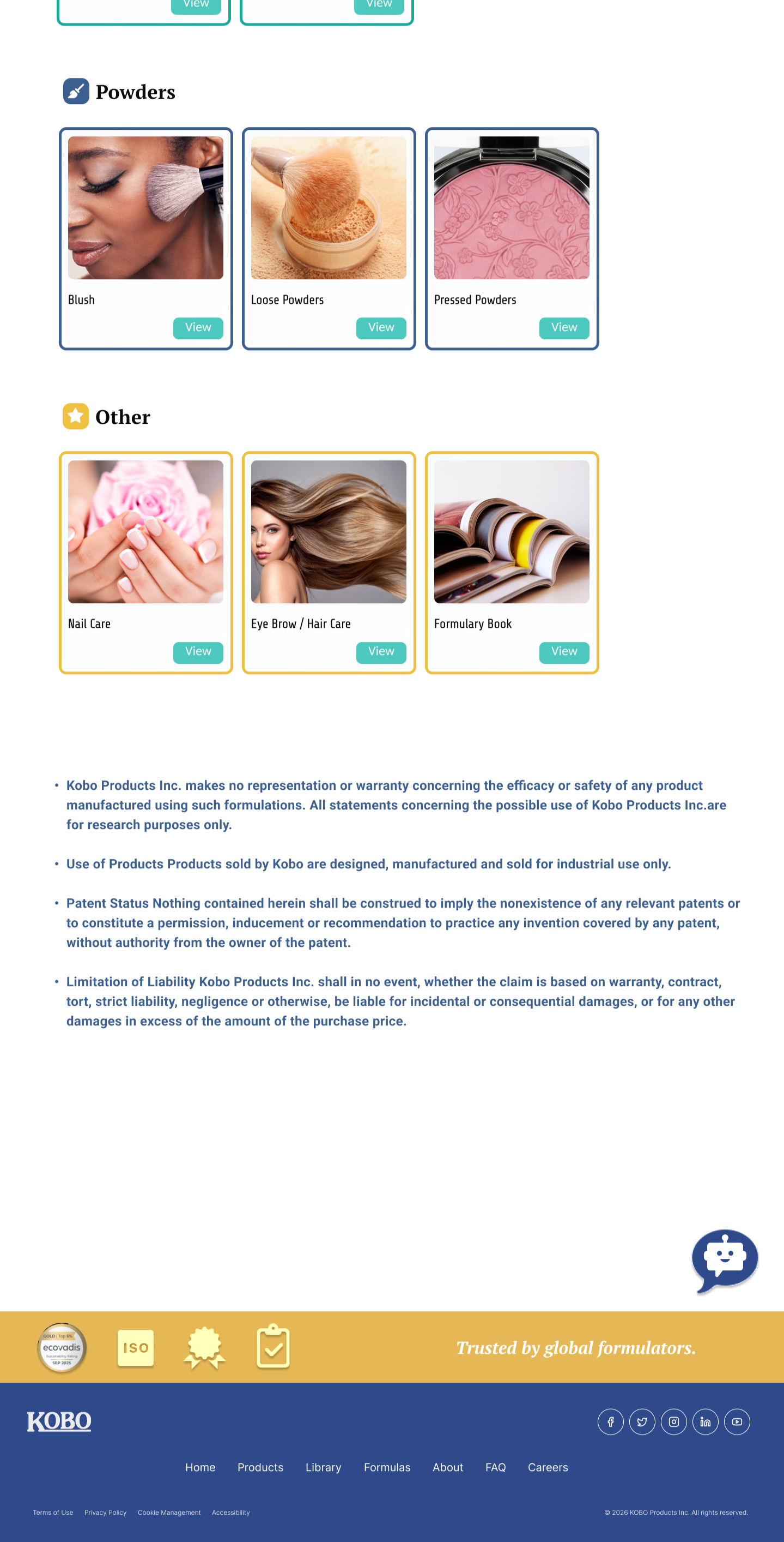
Specific Product (Right)
Sunscreen/selector flow: All Item details are now grouped concisely without having to access SDS, while still having the option to download it
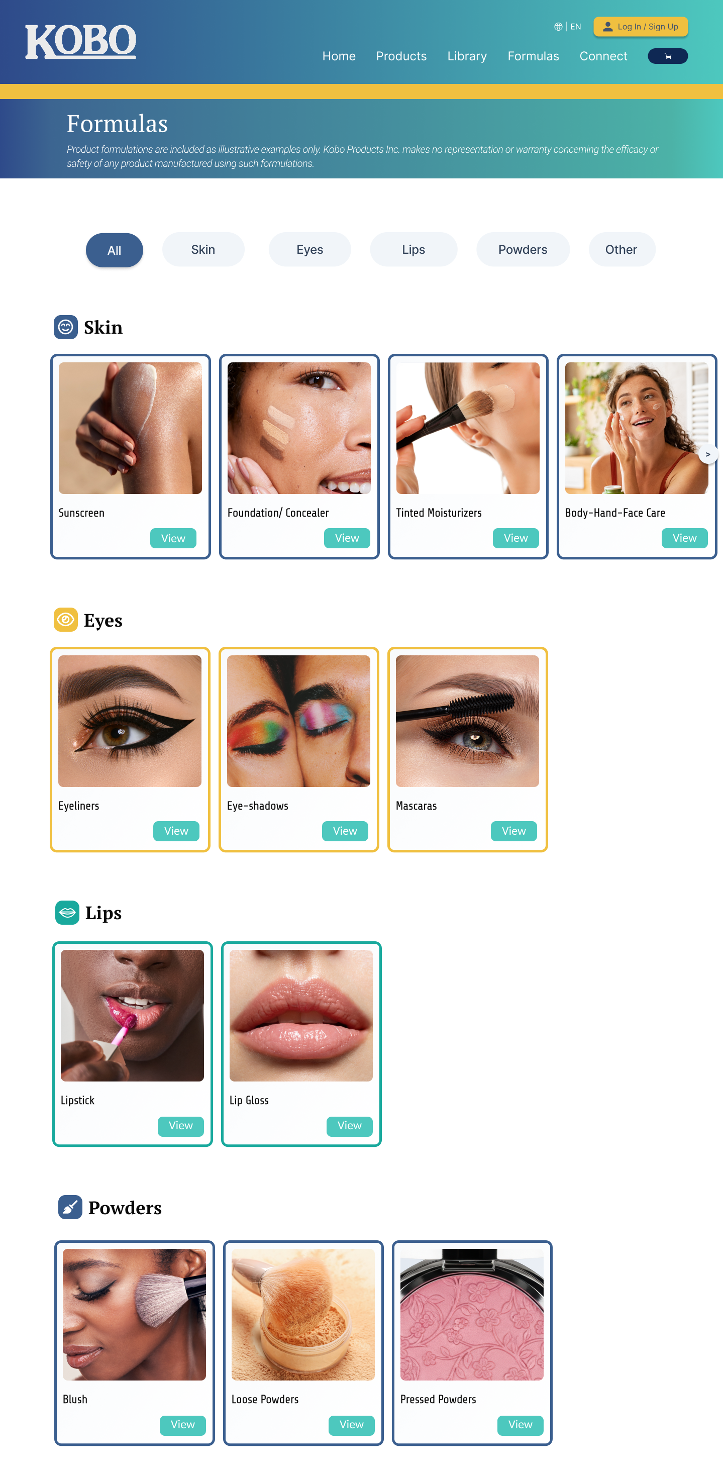
Formulas
Column behavior fixed
Sorting clearly labeled
No more accidental redirects
Warnings/Preface still clear on bottom of page
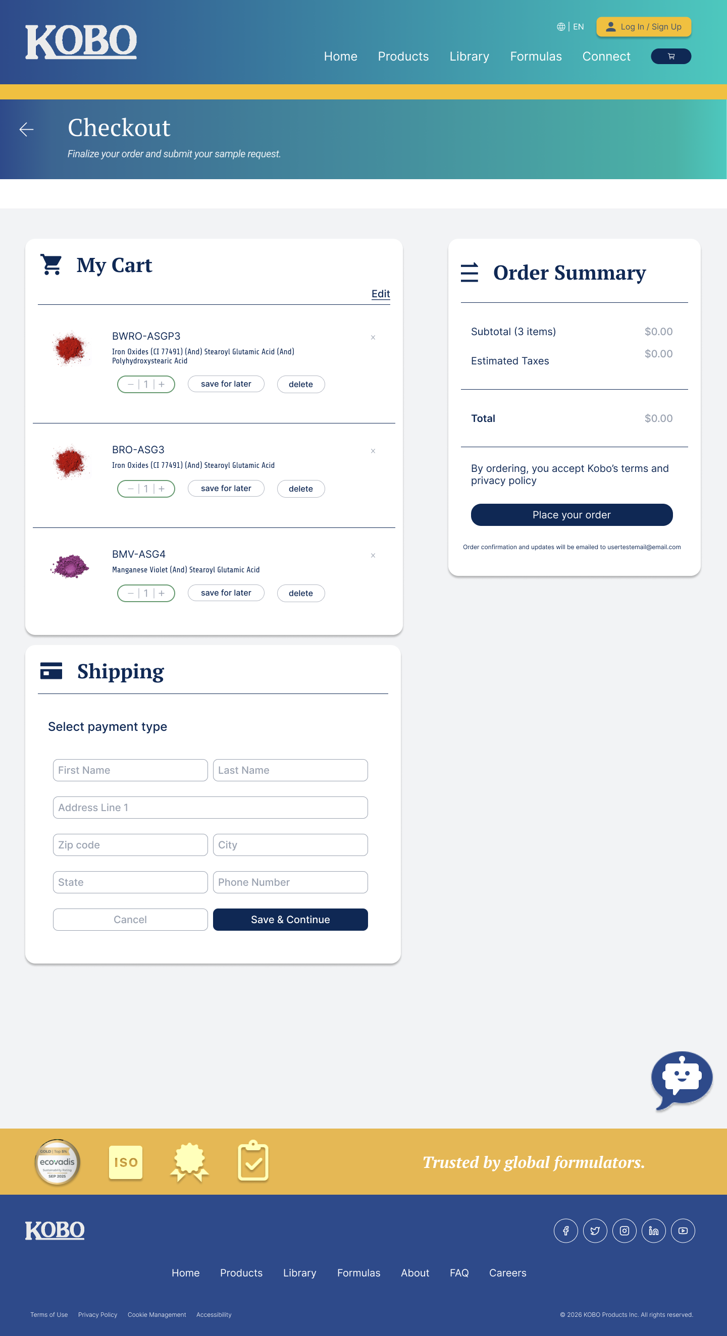
Checkout
Full checkout flow with choice validation and clear CTA’s
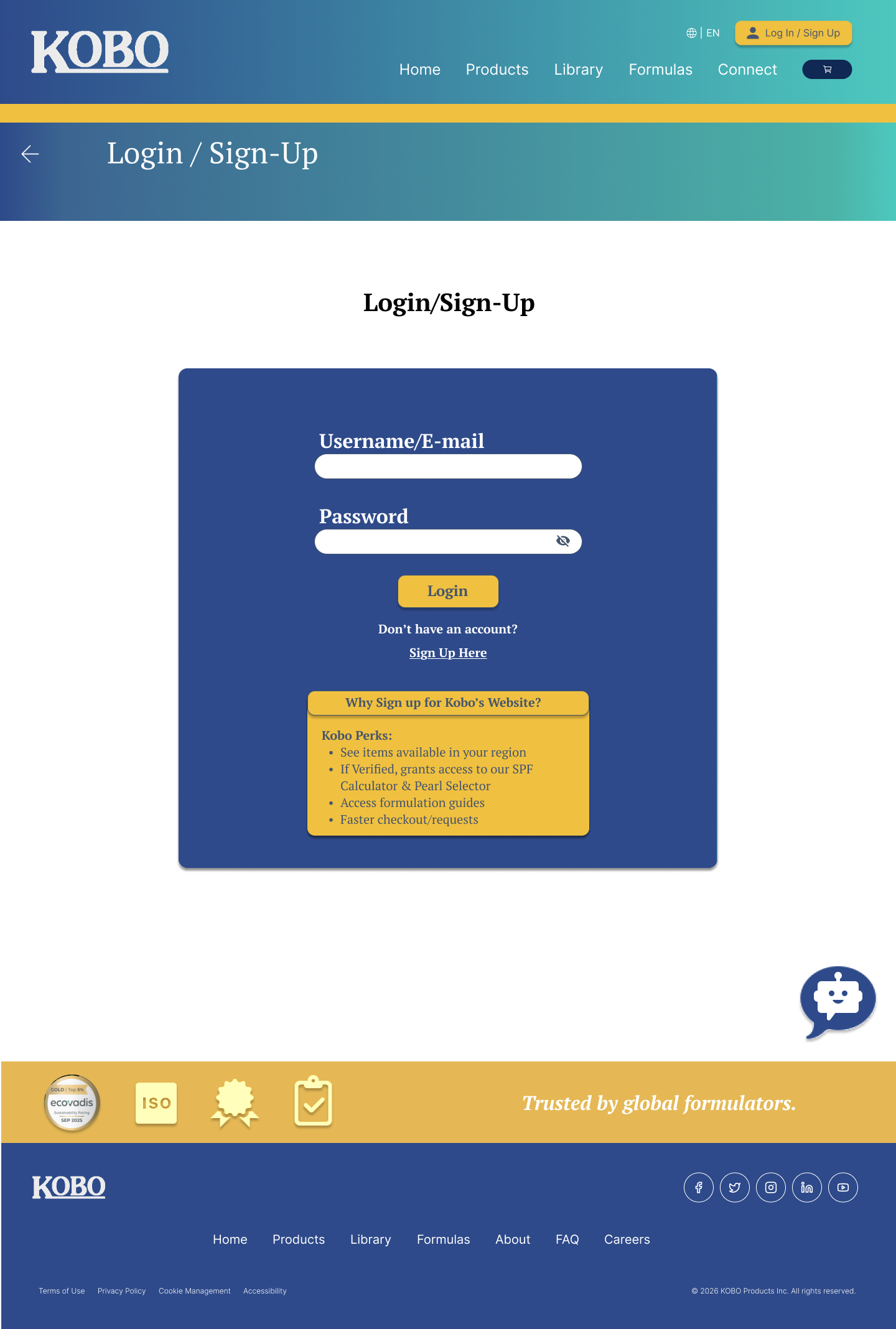
Login/Sign-Up
Sign-in made visible and valuable:
Gated SPF calculator, sample ordering, and regional products
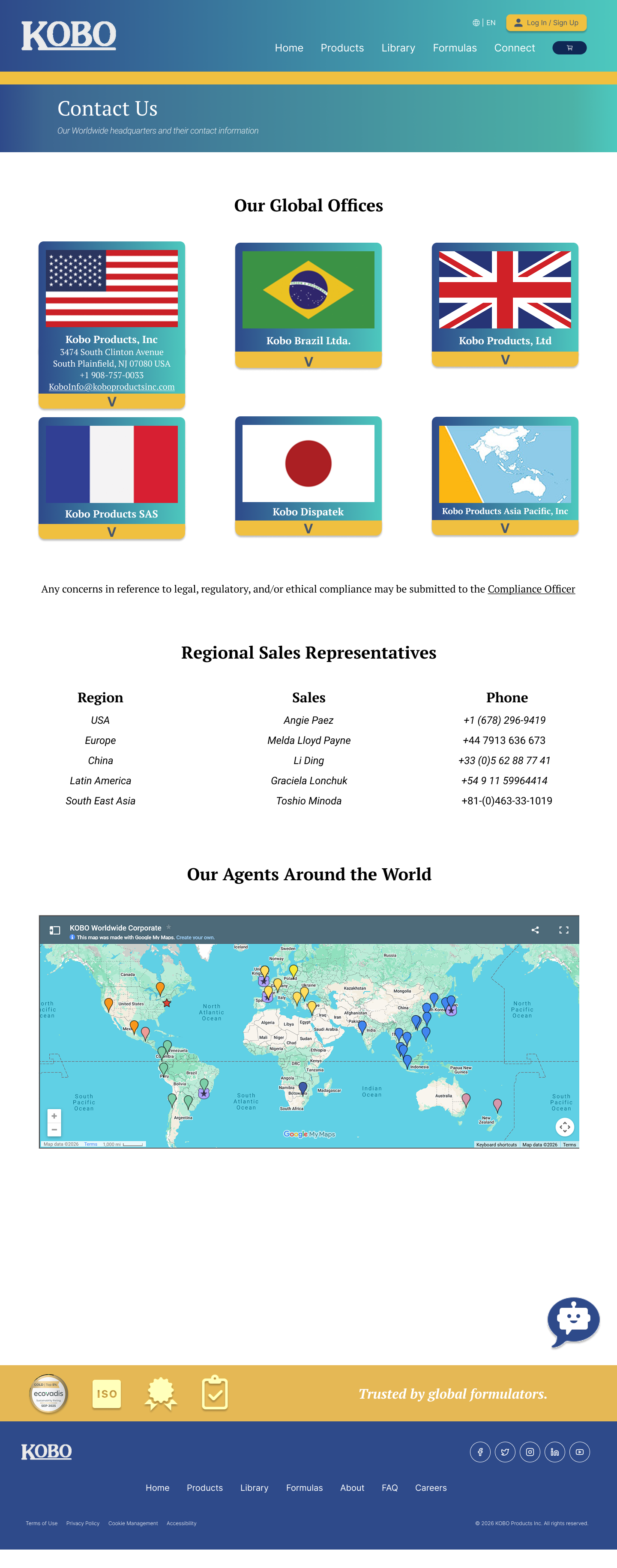
Contact
Information the same, presentation is different
Modern drop down menus to save space.
Final Deliverables
Final deliverables were handed off to Kobo stakeholders in May 2026, including the complete Figma prototype, a PDF design spec, and this research report. The redesign addressed the site's core structural problems while preserving Pascal's database-first mental model — the skeleton stays, but the interface finally matches the sophistication of Kobo's science.
Below is the final PowerPoint presentation and Figma file PDF. Thank you for Reading!!